Thursday, May 13, 2010

The background story on how to imitate the Minolta/Sony Smooth Transition Focus bokeh on regular, large-aperture lenses

This is an investigation of a concept, not the actual building process. This article will involve more mathematics than you’d probably care to read.


Basis of the STF

The STF lens is an innovative lens by Minolta (and now marketed by Sony) that gives exceptionally smooth bokeh by using a piece of grey-coloured glass to regulate light fall-off of the bokeh.

Very simply, this works by making the circle of confusion’s (the bokeh) brightness gradually fade. This is in contrast to normal lenses where the circle of confusion is a very well defined circle (or hexagon/pentagon/octagon, if the aperture blades are slightly closed).

The results are very smeared circles of confusion, as illustrated by the comparison images below.


Photo using a regular, large aperture lens



Photo using an STF lens


The design and ingenuity behind the STF mechanism is described here, with lots of sample photos from the STF lens.


Existing imitation techniques

On Minolta Dynax 7 film cameras, the STF’s smooth bokeh can be mimicked by taking seven exposures on one frame, each exposure with a smaller aperture size. This results in circle of confusions with bright centres and progressively dimmer towards the edge.

Alternatively, a long exposure can be made in dim lighting with the camera mounted on a tripod. The aperture ring can then be manually turned to reduce the aperture over the entire duration of the exposure. For this approach, manual lenses with no aperture clicks are most suitable.


Proposed filter-based mimickery

Here, I propose using a lens filter to reproduce the light falloff that an STF lens’s coloured lens. If a filter can be darkened at the edges to allow a gradual light falloff, then the resulting bokeh will have a similar falloff characteristic. The falloff can be controlled by adjusting the darkness of the glass at different distances from the centre.
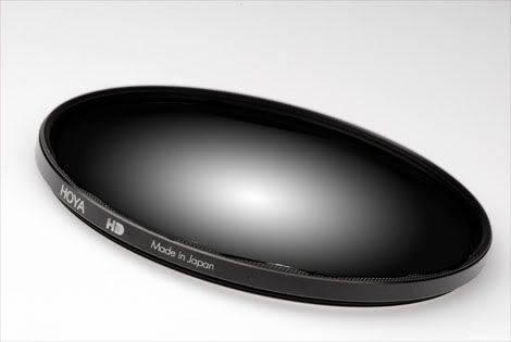

Proposed concept: radial gradient neutral density filter


This filter-based approach has been used to shape bokeh, resulting in heart, star, square shaped bokeh:
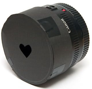

A heart-shaped bokeh filter



Result from a heart-shaped bokeh filter: circle of confusion (bokeh) partially obscured, resulting in heart shape


Light falloff modelling

Light falloff on the proposed radial ND filter can be done by attempting to mimic the STF lens’s material thickness and how it absorbs light.

The first assumption would be to make an approximation of the filtering element’s lens shape. It is reasonable to assume that the lens is a spherical lens, since spherical lenses are generally much easier to cut than other aspherical shapes.

Based on schematics by Minolta (above), the lens’s geometry can be scaled to a common distance scale based on the lens’s radius:
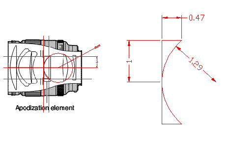

Approximating the coloured glass's dimensions


Lens radius: 1.00r
Lens thickness at centre: ≈ 0
Lens thickness at edge: 0.47r
Sphere radius: 1.29r

After some geometric manipulation, the lens thickness can be expressed by the equation

which describes the lens thickness, t, at a particular radius, r.


To calculate the optical density of the glass, it’s useful to note that the aperture number of the Minolta STF lens is f/2.8, but the amount of light let in is equivalent to f/4.5 (the lens’s name is 135mm f2.8 [T4.50] STF). This can tell us that the coloured lens removes approximately 1.4 stops of light, from the following relation:
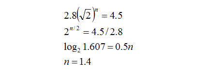

If by removing 1.4 stops of light, this means that only 0.51.4 (39%) of the incoming light passes through; the rest is absorbed by the coloured glass.


In order to select the correct optical density for the filter to match Minolta’s design, we need to match the total light transmitting through the filter to be similar to what Minolta has for the STF lens (39%).

Arbitrarily assuming that the edge of the lens removes p stops of light passing through (similar to the dynamic range of slide film), and using the knowledge that the glass thickness and optical density is proportional, the number of stops removed at a particular radius can be expressed as:
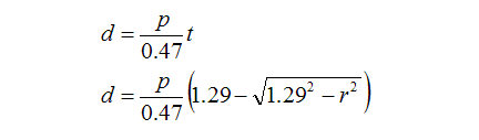
(0.47 is the thickness of the edge of the coloured lens)

This means that for light passing through any portion of the lens, the quantity that passes through can be expressed as 0.5d. To calculate the total amount of light passing through the entire lens, we need to add intensities of all the different rays of light coming through (some rays weakened due to passing through lots of dark glass, some rays not so weak due to passing through less glass).

The integral below does that:
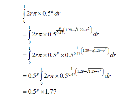

To find the value of p, the above equation needs to match the transmissivity of the Minolta’s coloured lens, which is 39%.
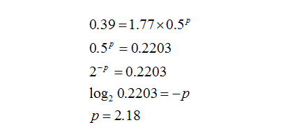

Therefore, the edge of the filter needs to absorb 2.18 stops of light, letting through 22%, while the centre practically lets everything through.
For the proposed filter to match the light falloff of the STF’s bokeh, the filter’s darkness needs to be the same as the STF’s coloured lens. Therefore, the same equation can be used to describe the filter’s darkness at all radiuses:
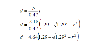

For this equation, the length scale is set such that the filter’s radius is 1.00.


Having obtained the proper light falloff characteristic and the relationship between optical density and radius for the filter, the filter can be constructed. This article will be continued as progress is made during construction.

Labels: , , ,

Wednesday, October 14, 2009

Hydrodynamics for noobs

Seeing that my work load is particularly low today, I’ll attempt to clarify some fundamental concepts regarding the flow of water1 through pipes and fittings.

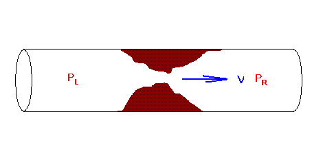
A very fundamental notion to understand in hydraulics is the relationship between flow speed and pressure. A partially blocked pipe will be used to illustrate this relationship.


In this example, the pressure on the left, PL, is greater than the pressure on the right, PR. This pressure difference will accelerate water through the blockage, from left to right. As the speed of water flow increases, friction also increases. This friction force is proportional to the square of velocity: doubling the velocity results in four times the friction; tripling the velocity results in nine times the friction.
The flow of water will continue to increase until such a flow speed where the pressure difference, PL - PR is balanced by the friction of water rushing through the narrow blockage.

Instead of expressing the friction/ flow resistance as a friction force, it is commonly expressed as a pressure difference between the upstream and downstream areas, as a function of flow speed.

ΔP = kV2

This approach to expressing flow resistance is very convenient for practical problems. For example, one may wish to pump a certain volume of water through a valve into a water tank. If the desired flow speed V is known, and the valve’s value of k is known, the pressure difference between the valve’s front and back can be determined. Knowing the pressure inside the water tank, the pressure before the valve needs to be greater than the tank’s pressure by ΔP. This approach also can be used if there are several valves: the pressure difference across the valves can be added together to find out the total pressure loss that occurs when water flows through the system.


What happens when you open a valve in a water tap?

For simplicity, we will assume the water source for a tap is at a constant pressure, and the tap opens out to atmospheric pressure. This is quite a reasonable assumption, especially if the tap is connected directly to a water tank with very minimal lengths of piping.

As is the case for water taps, opening the valve allows water to flow out of the tap. Water flows from the high pressure side through the valve and out to the low pressure side. The flow speed is limited by the tap’s flow resistance k.

As shown above, the flow speed and pressure difference is related by ΔP = kV2. Given that the pressure difference does not change, the only way to regulate the quantity of water coming out of the tap is by changing k. This happens when the valve is opened or closed. When the valve is closed, k increases (completely closed, the value of k is infinity- there is zero flow even when pressure difference is a finite quantity). When the valve is opened, k decreases.

Notes:
1. or any other viscous and incompressible fluid

Labels: ,

Sunday, February 15, 2009

Fun with the MoTeC data interpreter

What I did for Valentine’s Day:
Played GTR 2 for a few hours.

GTR 2 is a fearsomely realistic racing simulator based on the 2003 and 2004 FIA GT Championship series. While there are a huge number of bells and whistles, one of the most fascinating features of the game is the ability to save the car data into a MoTeC log file.

This is the same file format that a MoTeC data logger on an actual race car will produce: a time history of individual wheel speeds, suspension positions, suspension speeds, engine revs, throttle position, brake pedal pressure, steering angle, longitudinal acceleration, lateral acceleration, individual tyre temperatures at the inside, centre and outside areas…

And with the MoTeC data interpreter program, magic is possible.


***


The user can perform various mathematical operations on any combination the generous set of data logged by the MoTeC data logger.

For example, the instantaneous radius of curvature of the vehicle’s path can be calculated by rearranging the following equation:
a = v2/r
r = v2/a

Both the vehicle speed and lateral acceleration are measured, and so the radius can be determined.

Even more interesting, a general relationship between the vehicle’s speed and aerodynamic downforce can be observed after the data is suitably processed.

The principle objective of demanding greater aerodynamic downforce in a racing car is to allow greater acceleration (both in the longitudinal and lateral directions). Consequently, greater downforce will allow the vehicle to have higher accelerate.

From the logged longitudinal and lateral accelerations, the acceleration magnitude of the vehicle can be determined:
|a| = sqrt( along2 + alat2)

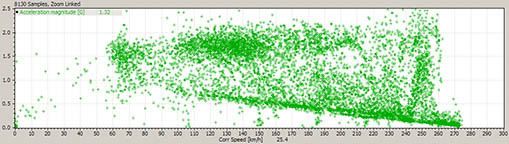
When |a| is plotted against vehicle velocity, the following scatter plot appears:


Click here for large size image

x axis: vehicle speed, v (km/h)
y axis: acceleration magnitude, |a| (g)
This plot consists of data recorded over a distance of 6 laps, equivalent to a duration of 13 minutes. Data was recorded at 10 Hz, producing 8130 data points.


Two general trends are visible:
the lower trend, consisting of a straight line that indicates a decreasing acceleration at higher speeds
the upper trend, indicating the maximum achievable acceleration increases when vehicle speed increases

The lower trend line corresponds to data recorded when the vehicle is accelerating on straight sections of the track. Given that the power output of the engine is maintained near the peak output (by adjusting the gearbox ratios to suit the track), the straight line is consistent with the fact that an object accelerated with a constant power will accelerate slower when the object is moving at a faster speed.

The upper trend is not as clear, but is nonetheless visible as an upward sloping trend.
At 60 km/h, |a| is approximately 1.75 g.
At 100 km/h, |a| is approximately 1.85 g.
At 160 km/h, |a| is approximately 2.10 g.
At 260 km/h, |a| is approximately 2.25 g.

Several data samples plot outside the upper trend because dips and bumps in the track will result in a different normal force acting on the wheels, thus allowing momentary increases and decreases in absolute acceleration.

A small cluster of data at 250 km/h show substantial deviation from the upper limit of acceleration. This, too, is caused by changes in track elevation where the main straight slopes upwards.


A similar plot can be produced showing lateral component of acceleration instead of total acceleration. In this case, |alat| was plotted against vehicle speed.

To prevent the chart from being cluttered with data not related to lateral acceleration (on straights, the lateral component of acceleration is close to zero), the plot was gated by plotting only data points that meet certain criteria.

Here, a new expression was defined, where
Steering = if (steering wheel angle > 25%) 1; else 0;

This expression will take the value 1 if there is substantial steering input, and 0 otherwise.

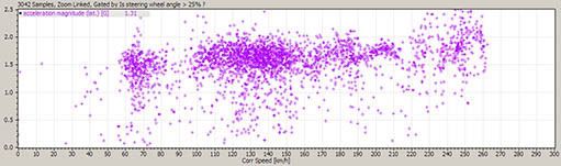
The criteria for gating the data is then set such that only data points with steering = 1 will be plotted, resulting in the scatter plot below:


Click here for large size image

x axis: vehicle speed, v (km/h)
y axis: lateral acceleration magnitude, |alat| (g)
This plot consists of data recorded over a distance of 6 laps, equivalent to a duration of 13 minutes. Data was recorded at 10 Hz, producing 8130 data points. Of these, 3042 data points satisfied the gating criteria and were plotted.


The |alat| plot resembles the |a| plot, except for the absence of the lower trend line. This is expected, because the lower trend line is associated with longitudinal acceleration driven by the vehicle’s engine.

A trend line indicating the upper bound of acceleration magnitude was constructed by approximation, and the following correlation appears:
|a|max = 0.0017 V + 1.56,
The units for |a|max and V are g and km/h respectively.


With the correlation between maximum |a| and vehicle speed approximated, a new variable called theoretical max acceleration was defined
theoretical max acceleration = 0.0017 vehicle speed + 1.56
This variable indicates the maximum acceleration that the vehicle tyres can provide.

When the instantaneous values of the theoretical max acceleration is compared against the actual accelerations, it can show areas where the driver can improve his/her lap time. For example, it can reveal that the driver can apply the brakes slightly later and harder on entry into a particular corner, thus shaving several milliseconds from the lap time; or that the vehicle can move slightly faster at a particular curve without exceeding the traction limits of the tyres.

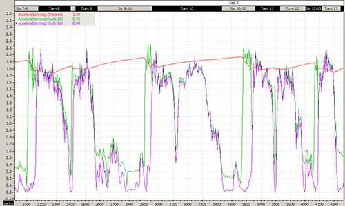
In the following graph, theoretical max acceleration is plotted together with actual |a| and |alat| in the upper graph. The max theoretical acceleration approximates the shape of the peak accelerations but is not accurate due to the coarse approximation for the speed and downforce correlation.


Click here for large size image

x axis: distance (m)
y axis: theoretical max acceleration, |a| and |alat| (g)
This plot consists of data recorded over a distance of 2.8 km. Data was recorded at 10 Hz, producing 631 data points.

Labels: , , ,

Monday, May 19, 2008

Getting intimate with cooling towers

I've always had a thing for cooling towers. There's a dignified aura about them – huge bulky things squatting dormantly, passively emitting pleasant clouds of water overhead.


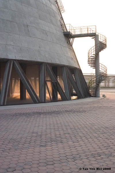
The exterior of a cooling tower


Cooling towers provide a source of cool water (colder than ambient temperature) by evaporating a portion of the water. The evaporation process requires an absorption of latent heat from the environment. This absorption thus cools the environment (the remaining water).


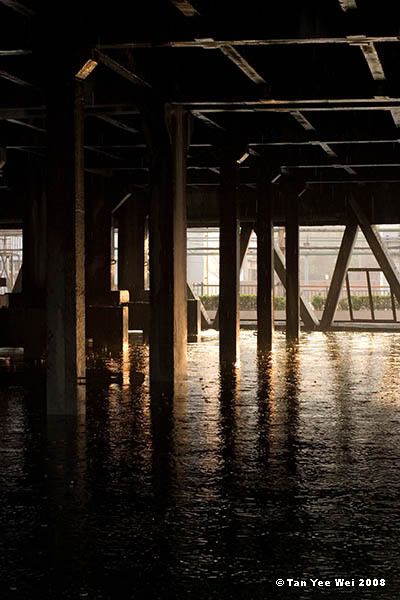
The interior of a cooling tower at partial flow


A cooling tower is a large, open ended cylinder installed vertically. Water is sprayed from the top, and the droplets fall into a pool at the bottom. The water is then pumped up again in a recirculating loop. As water is evaporated, more water is added to maintain the water level in the pool.


Click here for large size image
The interior of a cooling tower running at full flow


<3 <3

Labels: ,

Saturday, May 17, 2008

Note: the notes for this article are much longer than the article itself

For the first time in a long time, I took a clean sheet of A4 and drew a straight line down the middle to split it into two columns.*

I started making notes with a pen, and stopped to stare in horror at the tortured traffic accident I had produced. It was ugly. Now I know how dentistry students feel when they make a mess out of their orthodontics practicals.

I stopped writing on paper when I graduated 3 years ago. I switched from using pen to pencil after finishing secondary school 8 years ago, when I discovered the pencil's greater tolerance to slipshod hand strokes.**

Enough time has been wasted, back to the books.


Notes:
* with no columns, too much paper will be wasted as most lines will be just a few words long. I find wasting clean paper to be such a sin.

** A ball point pen's line darkness is extremely sensitive to applied pressure. One can even say that there is a singularity. If you hover the pen very lightly across the page you might find that there is no ink applied. But increase the pressure a bit and the darkness jumps up markedly.

On the other hand, a pencil's line darkness is almost linearly proportional to the applied pressure. An increase in applied pressure will result in a proportional increase in line darkness.

This phenomenon can be easily explained by looking at the mechanism by which the pen and pencil applies the ink/graphite.

The ball point pen uses a sphere within the tip. When the sphere rolls, it carries ink from within the housing to be applied onto the paper.

The darkness of the pen's line can be controlled by changing the applied pressure (within a small range). This is because a greater pressure will cause the pen's sphere to press into the paper, and thus come in contact with a greater surface of the paper and therefore apply more ink on the paper. This is why smooth and hard surfaces cannot be marked by a ball-point pen: the smooth surface does not provide enough friction to roll the ball, and the hardness means that the surface does not deform and hence the inked ball comes in contact with a very small area on the surface.

In contrast, a pencil applies graphite by shearing the graphite off the graphite shaft. A greater applied pressure will cause more graphite to be sheared off, resulting in a darker line.

Labels: , ,

Saturday, September 29, 2007

Correlations between the, MYR, AUD, USD and EUR - a qualitative assessment

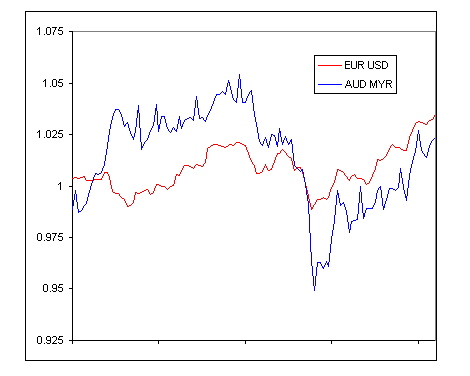
Of late, the US Dollar (USD) has been falling against the Euro (EUR). In the past days, the USD has broken all-time-low records against the Euro several times. Interestingly, the Australian Dollar (AUD) strengthened markedly with respect to the Malaysian Ringgit (MYR) over this period of time.


The Euro strengthens against the US Dollar, while the Australian Dollar strengthens against the Malaysian Ringgit


This observation suggests that it is plausible that the value of the AUD is closely connected to the EUR, and the value of the MYR is closely connected to the USD. If this is indeed the case, then the fall of the USD against the EUR will be partially mirrored by the MYR decreasing in value against the AUD.

To investigate this, the MYR will be compared with the USD and EUR to find which currency is more closely connected to the MYR, and the AUD will also be compared to the USD and EUR.


Data presentation

Average daily exchange rate data from the past 5 years are used. All data are normalised by dividing the daily exchange rate by the average exchange rate of the previous 100 days. The normalisation operation (dividing by an average) will bring all values close to 1, so that different exchange rates can be compared easily on the same scale. Effectively, the normalisation process highlights the percentage change in exchange rate.

The selection of 100 day moving average is mostly arbitrary, but the reasoning is so that gradual trends occurring over time scales of 3 months or more are not shown, but changes occurring at smaller timescales are shown.


Data comparison approach

To find the correlation of the MYR against the USD and EUR, normalised exchange rates between all three currencies will be plotted on the same graph.

In the limiting case, where the MYR is exactly correlated to the USD, the USD-EUR rate will be correlated to the MYR-EUR rate. In this limiting case, the normalised MYR is identical to the normalised USD, thus the normalised MYR-EUR and normalised USD-EUR exchange rates are identical.

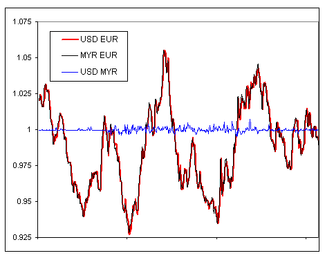
In the past, the MYR was pegged to the USD at a fixed rate of MYR 3.8 = USD 1. This represents the limiting scenario described above. The figure below shows a comparison of exchange rates between September 2003 and September 2005, and the USD-EUR exchange rate is exactly the same as the MYR-EUR rate in that period.


Echange rates between the Malaysian Ringgit, Euro and US Dollar for the period between Sept 2003 to Sept 2005.


In summary, if the MYR is closely correlated to the USD, then MYR-EUR and USD-EUR exchange rates are closely correlated because there is little difference between MYR and USD.


Data analysis - MYR

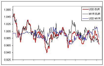
The following graph shows the MYR, EUR and USD exchange rates for the past 830 days (an arbitrary choice). The exchange rates have been chosen so that the USD-EUR forms the basis of comparison. If the MYR is closely related to the USD, then the MYR-EUR rates should resemble the USD-EUR rates.

On the other hand, if the MYR is closely related to the EUR, then the USD-MYR rates should resemble the USD-EUR rates.


Click here for large size image

Exchange rates between the Malaysian Ringgit, Euro and US Dollar for the period between July 2005 to Sept 2007


In the earlier half of the period graphed, the USD-EUR and MYR-EUR rates are very similar, suggesting that the USD and MYR are still strongly correlated. Closer to the present, near the end of the graphed period, the correlation is less obvious. However, the MYR is still closer to the USD than to the EUR.


Data analysis - AUD

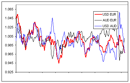
The following graph shows the AUD, EUR and USD exchange rates for the past 830 days (an arbitrary choice). The exchange rates have been chosen so that the USD-EUR forms the basis of comparison. If the AUD is closely related to the USD, then the AUD-EUR rates should resemble the USD-EUR rates.

On the other hand, if the AUD is closely related to the EUR, then the USD-AUD rates should resemble the USD-EUR rates.


Click here for large size image

Exchange rates between the Australian Dollar, Euro and US Dollar for the period between July 2005 to Sept 2007


From the 830 days graphed here, the AUD follows the EUR in a fairly consistent manner. Thus the AUD is much closely correlated to the EUR than to the USD.


Concluding remarks

From the analysis done above, it is shown qualitatively that the MYR is closely correlated to the USD, and that the AUD is closely correlated to the EUR. A change of the USD-EUR exchange rate will be reflected in a similar change in the MYR-AUD exchange rate.


Additional information

Exchange rates
5-year data for normalised rates used in this analysis can viewed for:
MYR, EUR, USD
AUD, EUR, USD

Labels: , ,

Saturday, September 01, 2007

The engineer strikes back: a brief theoretical investigation in the design of vibrators (vaginal stimulation devices)

One of the housemates pointed me to this entry by Finicky Feline:
With great sadness, I gave it one last kiss and threw it in the dustbin.
My brrbrrbrr, at 20 months of age, has died on me. Sputter sputter and then silence.
We had some ecstatic moments you and I.
But maybe it’s a blessing in disguise because I’ll finally need a man.


“She calls her thing brr brr brr!”
“Hmm, do those things pulsate?”
“Why are you asking me?”

While changing, I had a sudden flash of insight: the pulsations of a vibrator can be incorporated mechanically without the need for switching/oscillating electronics. I ran upstairs to explain to the housemate...


A commonly employed method to set up vibrations is to install a lop-sided piece of weight on a rotating shaft. For this application of pulsating vibrations, two eccentrically mounted (a fancy way of saying ‘unbalanced’) weights are required. The rotating weights are to be driven at similar but not identical speeds.

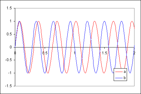
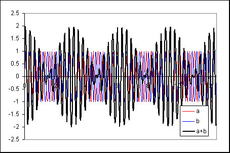
The force exerted (in the x-direction) by a rotating mass is sinusoidal. Because the two weights are rotated at slightly different speeds, the sinusoids have slightly different frequencies:


Side note:
The similar but non-identical speeds of these rotating weights can be easily designed by the use of gears. Shaft A (which holds mass a) can be connected to shaft B (which holds mass b) by a pair of gears. In the examples used here, the gear on shaft A has 22 teeth; the gear on shaft B has 20 teeth. A motor driving any of these shafts would drive both of them with the preset ratio of speeds.

The combined effect of sinusoids of different frequencies (but identical amplitudes) exhibits a beating trend: the vibration frequency is the average of the two vibrations, while the beating frequency is the difference between the two vibrations.


Side note:
The centripetal/centrifugal force (F) associated with an eccentric weight of mass M, eccentricity e (distance from shaft centerline to centre of mass) and rotation speed ω is of the following form:
F = M × ω / e

Given that the force amplitudes of both shafts are to be the same,
F1 = F2, and hence
M1 × ω1 / e1 = M2 × ω2 / e2

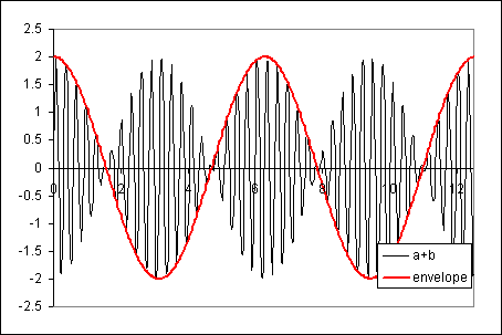
The following figure shows the combined vibration with an envelope equivalent to the frequency difference between the rotating masses:


Later, when I was washing dishes, the complication of the vibrator problem revealed itself. The vibration amplitude not only pulsates in the x direction, but also in the y direction. What’s more, the pulsations in the x-direction are out of phase with the pulsations in the y-direction.

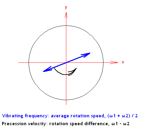
Restricting the analysis to the x-direction gives a severely misleading picture of the vibration behavior of this hypothetical Brrbrrbrr. When observed in 2 dimensions, the behavior of the vibration is rather interesting.

The direction of vibration precesses (rotates slowly), the rate of precession being equal to the speed difference of the two rotating masses.


This is what gives the pulsations in the x and y directions. As the direction of vibration rotates to coincide with the x-direction, the amplitude of vibration is the greatest in the x-direction. When the direction of vibration is perpendicular to the x-direction, there is no amplitude in the x-direction. Hence, the x-vibration pulsates.


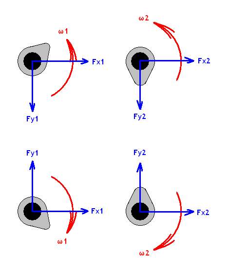
So it turns out that the pure pulsation I was searching for cannot be found in pairs of rotating masses. However, the pulsation can be restored by canceling vibrations in the y-direction, leaving only the x-direction to pulsate. This can be done by two pairs of rotating masses that rotate in opposite directions.


The arrangement shown above is designed so that the y-direction component of the centripetal forces are set up in opposing directions so that they contribute to a net of zero y-direction forces. But, the x-direction forces are arranged in the same direction, so that the x-direction vibration amplitude is doubled. And here, the analysis for uniaxial vibration (as presented above) can be applied, and pulsation is achieved.

Success!

Labels: , ,

Tuesday, July 03, 2007

A brief histogram-based qualitative comparison between the Panasonic FZ-30 and entry-level DSLRs

Abstract
The objective of this investigation was to compare the dynamic range of the Panasonic FZ-30 with entry level DSLRs. Lens flare is also briefly discussed.


Introduction of concepts
In general, cameras are devices that record light brightness values in the form of a continuous bounded spectrum of dark (black) to light (white). On typical (film or digital) cameras, dark areas are rendered as black while light areas are rendered as white.

The black and white areas represent the limits of the sensor- the sensor cannot detect light levels less than the black areas, and light levels more than the white areas. The ratio between light levels required to produce black and white areas on the sensor is known as the dynamic range of the sensor.
Dynamic range explained

Dynamic range is typically quoted in units ‘stops’. One stop represent 2 times of difference in light intensity; two stops represent 4 times; three stops, 8 times; 4 stops 16 times; 5 stops 32 times…

At first glance, it may appear odd that the dynamic range is quoted in multiplicative form (8 times, or 3 stops) instead of additive (3 lux, 4 lux, 5 lux…). The logic is demonstrated in the following example:

A hypothetical sensor would be black if 5 photons or less hit it, and would be white if 160 or more photons hit it. Once can see that the dynamic range is 160/5 = 32 times, or in a more conventional notation, 5 stops.

Consider two light sources giving out 5 photons per second and 3200 photos per second. Exposing a sensor to each of these sources for a second would expose them to give black and white, as the sensors would receive a total of 5 and 3200 photons respectively in that one second of exposure.

However, let the light sources be brightened significantly, so that the dim light now throws out 5000 photons per second, and the bright light is worth 3,200,000 photons per second. Exposing the same sensors to these light sources for a short period of time, 1/1000 second, would still result in 5 and 3200 photons on each sensor, again giving us black and white.

In both cases, the ratio of light intensities between the bright and dark sources is the same:
3200 photons per second / 5 photon per second = 32
3.2 million photons per second / 5000 photon per second = 32

However, the difference in intensity is not identical:
3200 – 5 = 3195 photons per second
3195000 photons per second

Thus the multiplicative manner of describing dynamic range makes more sense than additive.


Description of Cameras

The Panasonic FZ-30 is a regarded as a prosumer point-and-shoot superzoom camera with a fixed lens (7.4-88.8 mm f/2.8-3.7) of Leica design.

Entry level DSLRs used were the Nikon D40 and Canon 300D, both using their respective kit lenses (both 18-55 mm f/3.5-5.6).


Methodlogy and results

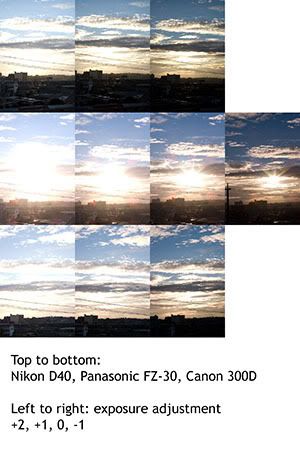
A scene with excessive highlights and shadows was captured at various exposure settings using all three cameras. The exposures were calibrated to be exactly the same: ISO 100, f/5.6 and exposure times of 1/200, 1/400, 1/800, 1/1600. In the case of the Nikon D40, it does not have the ISO 100 setting, so exposure times were halved to compensate for doubling the sensor’s sentivity.

The exposure corresponding to ISO 100, 1/800s and f/5.6 was arbitrarily chosen as the baseline exposure (0).


The captured images were cropped to contain approximately identical portions of the scene. The cropped scenes are presented in the figure below.


Click here for large size image


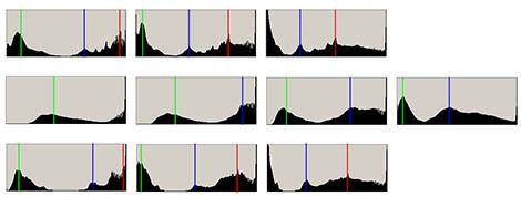
The histogram for each scene was observed in Photoshop CS2, and captured by using the Print Screen function. Distinct peaks (corresponding to large areas of similar darkness) were marked.
Histograms explained

Histograms show the frequency of various darkness levels within the image. The horizontal axis shows the darkness of pixels (dark on the left, bright on the right) and the vertical axis shows the quantity of pixels corresponding to each darkness level.


Click here for large size image


As the marked histograms show, the Panasonic FZ-30 has a remarkably narrow dynamic range. The main indicator is that where the DSLRs can accommodate 3 distinct peaks in the first two exposures, the FZ-30 is unable to do so even in the final one where the green peak is pushed closest to the left.

Curiously, the histograms from both DSLRs show that certain brighness levels are not represented (the histogram having zero height between the green and blue peaks) while the Panasonic one does not fall to zero.

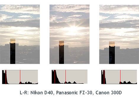
Further investigation shows that this is due to lens flare. Internal reflections from the intense sunlight were not well controlled, resulting in light hitting the sensor where it should not.

A region of the scene was further cropped so that it contained a portion of the dark foreground and a bit of the bright sky. Ideally, the horizon should be a sharp division between the dark foreground and bright clouds. A histogram of this cropped region should have two sets of peaks- a dark one corresponding to the dark foreground, and a light one corresponding to the clouds.


Click here for large size image


The histogram from the Panasonic FZ-30 shows that some of the light from the sun has spread into the dark foreground, resulting in a gradual drop off in brightness instead of a sharp transition.


Summary of results
Compared to entry level DSLRs, The Panasonic FZ-30 has a sensor with comparatively low dynamic range and lens which suffers from noticeable flaring.


Concluding remarks
The results are not surprising.
The Panasonic FZ-30 has a very small sensor (approximately 7.4 mm across) while the DSLRs have much larger sensors (approximately 24 mm across). The resolution is of these sensors not remarkably different. The DSLRs’ larger sensors allows each pixel to have a larger area and collect more photons. As a result, large signal amplifications is not required, and noise is well controlled thus allowing usable data to be extracted from regions with low light.

The FZ-30’s 12x larege aperture (f/2.8 - 3.7) zoom lens requires more compromises in terms of various design objectives compared to the 3x zoom (f/3.5 - 5.6) on the DSLR kit lenses.

Overall, these are the inherent drawbacks of having a high resolution sensor and large zoom range on a relatively small camera body. The Panasonic FZ-30 serves as a general purpose camera which does many things (macro, wide, long telephoto) with a small, lightweight package. It lies in a different category and has a different target market from DSLRs.

Labels: , ,

Monday, May 21, 2007

A halogen bulb's tungsten filament

I’ve been pimped by Politikus under the Thinking Blogger Award. Supposedly my blog is thought provoking. That's a good start; in a few years my plan to take over the world will be fully in place.

I’ll address that [tag] in a few days. Meanwhile, images...


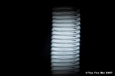
Click here for large size image
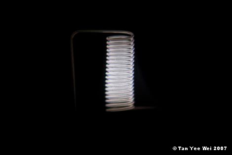
The filament is approximately 3 mm in height and has 19.5 coils
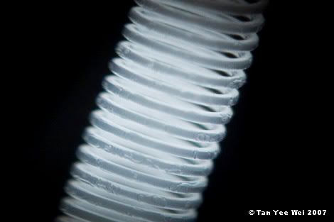
Jupiter-9 85 mm lens reverse mounted on Panasonic PZ30


Ever since acquiring the knowledge of microscopy, I have wanted to get a photograph of the filament in an operating halogen bulb. However, no camera can ever hope to achieve the preposterously short exposure times or sub-micron aperture sizes required to correctly expose the live coil. The only realistic alternative would be the use of some sort of high density filter to remove as much energy as possible, hence making the existing camera usable in this context.


Click here for large size image.
Defects and surface irregularities in the tungsten filament are visible on the bottom half of the coils. The 19.5 coils distributed over 3 mm means that the coil spacing is 0.15 mm. The gap between coils is about the diameter of the filamen, thus the filamen diameter is approximately 0.08 mm.
Super-Takumar 50 mm lens reverse mounted on Panasonic PZ30


With not even one neutral-density filter, much less a stack of them, I made do with a pair of polarizers. A pair of ideal polarizers would block half the light from passing when the polarizers are aligned in parallel, and block all light when aligned perpendicularly. Effectively, I had a variable-density filter with a factor ranging from 2 to slightly less than infinity.


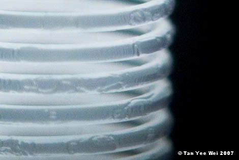
Click here for large size image
A closer view of the preceding image


The use of variable-density filtration has its benefits. The polarizer can be rotated to give a suitable degree of contrast to permit manual focusing. With that done, the shutter button is depressed halfway to lock the aperture and the histogram shows the final image’s brightness distribution. The polarizer can then be rotated to optimise the brightness distribution.


Click here for 100% crop image
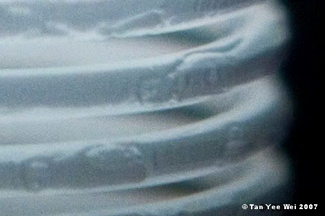
The thickness variations on the filament is approximately 1/15 the filament diameter (0.08 mm). Thus the bumps and gaps on the filament are approximately 0.005 mm or 50 microns in scale.
A closer view of the preceding image


Colour is not relevant in these photographs as the entire filament emits black-body radiation corresponding to 3000 K. Any colour seen in these images are the result of chromatic aberrations and white-balance tweaks.


A 100% crop of the preceding image

Labels: , , ,

Sunday, January 28, 2007

On the optical power of a lens and the effect of additional optical elements

Albert Ng remarked in recent comment:

I've been calculating lately, the relation between minimum focus distance, focal length and magnification factor; if you can focus as close as your focal length, you should get 1:1 reproduction. Hence, a 100mm macro can focus to 10cm near. Knowing this, I could get a +10 closeup to do the same thing on a standard 100mm (since +10 = 1000mm / 10 = 100mm focus when lens is actually set at infinity). However, how would I know where the focus will be at when the lens is NOT set on infinity?


Firstly, an unnessecary introduction to the units:

Dioptre: a measurement unit for the optical power of a lens. It is the inverse of the lens’ focal length. The net power of optical assemblies consisting of thin lenses placed closed together can be closely approximated by summing the optical powers (measured in Dioptre) of all the lenses. This is the advantage of using Dioptre instead of focal length.


Let’s say you use a 50mm lens. When its focus is set to infinity, its power is 1/0.050m, or 20 Dioptre. (After approximating the 50mm lens as a thin lens located 50 mm away from the film plane.)

Now, suppose you want to focus on something 50 mm away. Instead of turning the lens’ focus ring, you put another 50 mm lens in front of the first, but positioned back to front. The focus of this second lens is also set to infinity.

In this double-lens set up, light from the target enters the reverse-mounted lens, and is projected as parallel rays (since it is focused to infinity). The parallel rays then enter the second lens and converge onto the focal plane.

The second lens is identical to the first, so it would be rated at 20 Dioptre too. The total optical power of the system is 20 + 20 = 40 Dioptre.

If you used a 10 Dioptre lens instead of a reverse-mounted lens, light from 0.1 m away would be projected as parallel rays towards the first lens. These parallel rays would then be focused by the 20 lens onto the focusing screen. Thus a 50 mm lens that focuses on a subject 0.1m is effectively a 20 + 10 = 30 Dioptre lens


By using this argument, it appears that you can estimate the dioptre of a lens when it is not set to infinity. Working backwards, you can then estimate the subject distance.

Have fun.

Labels: , ,

Wednesday, November 22, 2006

Photoelasticity: photographic representation of residual stresses

Note: No image enhancements performed on the following photograhs.


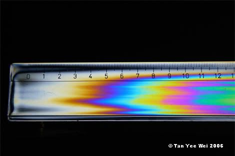
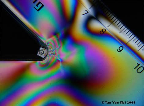
Click here for large size image


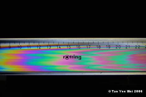
Click here for large size image


Certain transparent materials’ optical properties change when stressed. This property can be used to study stress distributions in complicated objects.

One particular application of such a stress-dependent optical property is photoelasticity. The process is described in an extremely brief and (probably) inaccurate manner below:
Two polarizers are alighed so that their directions of polarisation are perpendicular. No light can pass through this set up.
A transparent plastic model is placed between these polarizers.
The plastic changes the polarisation of light passing through, such that light that passes through the model can then pass through the second polarizer.
Regions with different stresses change the optical properties in varying manners, and the stress distribution in the model can be observed visually
I would conjecture that the stress is proportional to the density of fringes, and in directions perpendicular to the fringes.

For the real science behind photoelasticity, this is a good place to start looking.


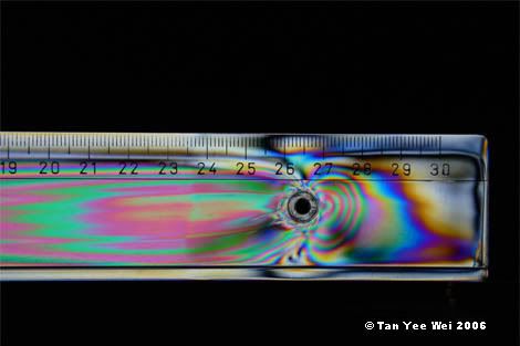
Click here for large size image


The stretched patterns along the ruler suggest that the manufacture of this item involved extrusion or rolling. The hole was then punched, resulting in residual stresses visible around it. There is a discontinuity between the 23rd and 24th cm marks, suggesting some sort of defect, probably a (shallow) surface crack. Stresses do not spread across the gap, resulting in different stress distributions across the crack.


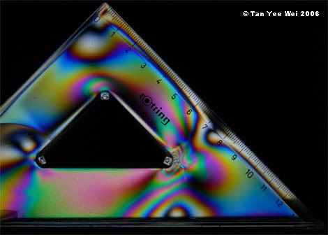
Click here for large size image


It is possible that this set-square was injection moulded. Molten plastic was forced at high pressure into the mould from three nozzles located at the corners of the set-square. The material then flowed outward, filling up the straight edges. Material from 2 different injection ports would meet partway along the straight edges.


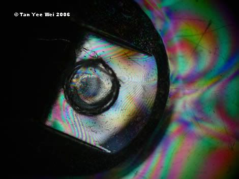
Click here for large size image


Click here for large size image

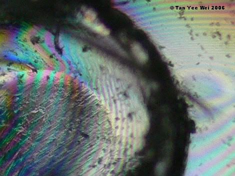
And of course, every geeky photoshoot must be accompanied with some sort of microscopy. Here, the image spans a length of approximately 8mm.


This is cropped from the previous image. The image spans 2mm.


The density of fringes on this stump shows that very large residual stresses are present in this part.

Labels: , ,

Saturday, April 29, 2006

The mechanical arm

Yesterday, I got my father a book for his birthday present.

The cashier at the bookshop was a young lady with a prosthetic left forearm and hand. It was quite a sight, the arm being coloured in olive drab (army green, one may say) and with a cable running the length of the arm and several metal supports for the cable. In place of 5 fingers, a wide aluminium clamp is used to grasp items. I reminded myself not to stare rudely at her prosthetic, thus I noticed that she had a neck length, densely curled dark blonde hair, grey irises in her eyes, a generally pretty face and a cheerful smile.

As I watched her go about processing the customer before me, I was quite fascinated with her comfort with her artificial hand.

While she was bagging my book, I ventured a question. "Excuse me, mind if I ask how you actuate that..." I trailed off, looking for a suitably concise phrase that would not be as dumb as 'fingers' (because it's a pair of pincers, not 5 fingers).

"Oh you mean how this works? Sure, I’ll show you in a minute," she replied, putting my father’s book in a brown paper bag.

She handed me the book, now wrapped in its brown paper bag. Flexing her pincers, she pointed out the cable that pulls them open. The cable runs to a metal scaffold protruding from the 'wrist', where it is then shrouded in a plastic tube very much like the coaxial brake cables found in bicycle brakes. The encased cable runs along the length of the forearm, where it is held by another metal structure near the 'elbow'. She pulled the sleeve of her blouse up a bit, revealing the more of the cable. The plastic shroud ends, and the bare cable is attached to a fabric sling of sorts that disappears up to her back.

By flexing certain muscles in her back, she can cause the contraction to pull on the cable, which in turn pulls the pincers open. Relaxing those muscles, the pincers close on their own accord by the action of springs.

"Impressive!" was all I could say. But then, show me the inner workings of a system and I’ll be impressed anyway.

"This hand is a simple one, but I quite like it," she continued, "the mechanical ones are too complicated with motors and the electrodes..."
I was lost. Isn’t this a already mechanical arm? A burst of clarity hit me- she actually meant 'motorised', which should be termed electro-mechanical, or at least electrical.
"The batteries too," I chime in, trying to act like I know the prosthetics trade from front to back. I mean, anterior to posterior.
"Yup. And sometimes they hurt, so I’ll be sticking to this one for a while. I’m happy with this," she said.

I thanked her for her time, and went on my way.

I do have a tinge of regret of not getting her to pose for a few portraits. I was actually worried she might be offended, but in hindsight, probably not. After all, she seemed very at ease with her prosthetic, and made no attempts to hide it. It was not in a long sleeve shirt. It was not skin coloured, but more like a slightly watered down shade of British Racing Green.

Damn it.

Next time, I must remember to ask myself,

What would Jesus ob!ique do?


End note:
Notice it did not even cross my mind to be curious about how and why the forearm had to be amputated?

Labels: ,

Saturday, April 08, 2006

Intake Horns - an excerpt from the draft of 'Automotive Engines'

I have gone back to writing my book. Yes, it sounds grand doesn't it?
Writing on my book.

Just remember that many books get written. A large quantity can never meet the standards required of publication. Some of those published never make it anywhere significant (the rubbish tip is somewhere, but...).

Anyway, here's a first draft of my latest section, "Intake Horns", from the chapter "Induction and Exhaust".

As this is a draft, I would be very happy if errors and omissions of any sort are pointed out. Thank you.


***

Intake Horns
An excerpt from the draft version of 'Automotive Engines' by Tan Yee Wei


Induction manifold: a branching pipe that delivers air and fuel to individual cylinders.

In many engines, intake air is filtered to remove dust and grit that may harm the engine, then piped towards the carburettor or fuel injectors, then diverted towards the engine block. Here, the pipe splits into smaller pipes, each delivering air and fuel to individual cylinders. This is when the induction manifold is relevant.

However, some extremely high performance and short race duration engines can make do without an air filter. It is also likely that this engine will have individual fuel injectors at each cylinder. Thus there is no need for the intake manifold which only serves to distribute air that has been modified by a central facility, namely the air filter and fuel injector.

In these cases, the induction ports of each individual cylinder are equipped with a pipe that widens at the opening in a horn shape to improve airflow. For obvious reasons, these are called intake horns.

These extremely high performance engines not only gain an advantage in not having to draw air through an air filter, they also do not have to draw air through long lengths of piping. The upside is less energy required to take air into the cylinder.

This advantage can also be applied to engines that require an air filter (but still retaining individual fuel injectors at the cylinders). The entire collection of intake horns can be enclosed in an air-tight box, which is connected to the air filter by a sufficiently large pipe. Thus the intake plenum is born, also referred to as the air box. The advantage of this arrangement is that the connection between the plenum and the air filter can be made arbitrarily large to reduce resistance, and the overall resistance in the intake system can be reduced significantly by taking the manifold out of the picture. In some cases, the air box also doubles as the air filter: the walls of the air box are made of air filter material, thus doing away with the extra piping.


The benefits do not stop there: these induction horns can be easily tuned to optimise airflow at certain speeds. This can be done by simply changing a set of horns for a longer or shorted set. Performing a similar operation with an intake manifold would be a terribly convoluted exercise, in all senses of the word.

In a competition engine, one might expect the horns to be tuned to perform best when the engine is producing its peak power, since the engine will be operating near its peak power most of the time. However, things might differ in the case of a passenger vehicle’s engine that is expected to operate at various speeds. The horns may be tuned to give the extra bit of power where the engine is lacking in power, so as to give it decent performance all round its operating speeds.

The major point of consideration in tuning the intake horns is the length of the horn. In general, longer horns give good performance at low engine speeds, and short horns give positive results at high speeds.

A simplified explanation of induction tuning is presented below.

Consider one cylinder of an engine with intake horns installed. At this moment, it is in the midst of the intake stroke- the intake valves are open and the piston is moving downwards, drawing air into the cylinder through the intake valves. Air in the intake horn is moving inwards towards the engine.

When the intake stroke is complete, the intake valves close. At the instant the valves close, air in the intake horn is still moving inwards. We would expect that this bulk of air will be stopped, since it will not get past the closed valve. Thus the air piles up against the closed valve- its velocity slows to zero, while the pressure and density increases.

This pressure build up then starts to push the air backwards out of the intake horn, the backflow only stopping when the excess pressure is dissipated.

This is the point when induction tuning becomes relevant. The length of the induction horn is adjusted such that the duration of the pressure increase corresponds with the time it takes for the engine to complete one cycle (2 revolutions). Thus at the time the pressure is ideal, the intake valves are already open for the next cycle of air intake.

The pressure and density build up thus aids to push air into the combustion chamber. Of course, one may see that if the engine speed is slower than ideal, the air would be already moving backwards by the time the valves open for the next cycle. The result is an engine that gives good performance only in a narrow range.

The next question would obviously be directed in the general direction of giving excellent performance at all engine speeds. In the upper echelons of high-tech, big money motor sports, variable length intake horns are used. Prior to 2006, variable length intake horns were used in Formula 1 engines. This naturally gave spot-on induction and good power at all engine speeds.


Labels: ,

Saturday, April 01, 2006

A step-by-step logical guide to improving a basic punch

In karate and taekwando, the forms/patterns/katas are routines with blocks, strikes and different stances. While they may be viewed as boring compared to exciting take-down techniques or sparring sessions, forms can be used as an invaluable teaching tool.

In all probability, the first form will involve the simplest of movements, with the punch and forward stance playing a major role.

For beginners, instructing on the stances is easy; how to execute a strike with forceful commitment is the tricky part. This essay will attempt to introduce a guide based on logical arguments that will arrive at a workable punch.

The forms will be used as the starting point, or axioms. One can even say that the forms will be accepted solely on the faith that years of development have refined it to its most practical incarnation.

The form (an excerpt):
The practitioner executes a block/strike and a forward stance, with the leading hand and leading foot on the same side of the body. The next movement is a step forward into another forward stance, with the other hand (now having become the leading hand due to the step) executing a punch.

A requirement of the form is that the step is finished the same time as the punch.


Argument 1:
The punch is designed to hit hard.
Therefore the fist is needs to move fast during impact.
In the form, the step and the punch is to be completed at the same time.
But the step is slow compared to the maximum speed of the punch.
Hence the practitioner should start stepping first, and start the punch near the end of the step such that the conclusion of these 2 motions coincide.


Argument 2:
The punch is designed to hit hard.
Therefore the fist is needs to move fast during impact.
To supplement the velocity provided by the extension of the shoulder and elbow, the shoulder itself should be propelled forward.
This can be done by rotating the upper body to push the shoulder forward, and also to lean the upper body forward in the direction of the punch.
Fist extension, body rotation and leaning must be performed simultaneous to ensure that the relative velocities add.


Argument 3:
The punch is designed to hit hard.
Therefore the fist needs to move fast during impact.
The extension of the fist relies on the upper arm rotating forward to drive the elbow up and forward, and the forearm rotating downwards to drive the wrist (and fist) forwards but not upwards (despite the elbow travelling with an upward velocity).
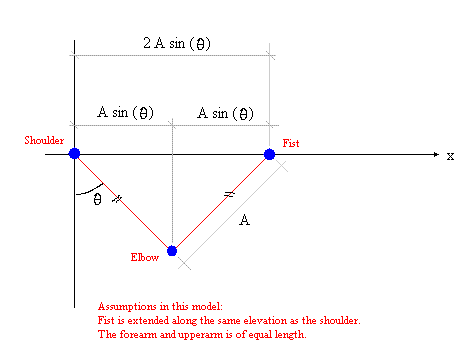
If the constraint of the elbow joint was ignored (the elbow can turn through 360 degrees as opposed to the real world where it only straightens to 180), at full extension of the fist, if the upper arm was still rotating, it will still bring the elbow upwards, but backwards. (The motion of the fist in the horizontal direction can be modelled as x = 2A sin (θ) where x is the horizontal distance from the shoulder, A is the lengths of the forearm and upper arm, and θ is the angle the forearm makes with the vertical. Refer to diagram.)
Therefore, maximum extension is achieved when the elbow is straight, but the fist’s velocity during maximum extension is zero.
Therefore, a punch that impacts during maximum extension is not a punch that hits hard.


Argument 4:
The practitioner does not wish to hurt oneself in the course of delivering a punch.
The elbow cannot turn more than 180 degrees (full extension)
At the instance maximum extension, if the upper arm is still being rotated by the muscles, and forearm is rotating downwards to keep the fist along a horizontal path, the elbow is moving upwards but not forwards not backward.
The elbow joint’s architecture forbids the elbow from travelling upwards because of the limitation of being only able to turn 180 degrees.
Any upward momentum of the limbs during full extension is dissipated via an impact within the elbow joint.
The elbow joint is not infinitely stiff.
Hence, there is an upper limit on the momentum that can be dissipated upon each impact to avoid damage.
Unfortunately, this upper limit is easily within reach of most people.
Thus to avoid injury, the practitioner must ensure that if the punch is not delivered to a target, the fist must be stopped before full extension by the action of muscle contraction instead of impact at the constraints of joints.


Argument 5:
The punch is designed to hit hard.
Therefore the fist is needs to move fast during impact.
The form is such that the previous step was a block/punch with the other arm extended, but this hand will be retracted to the side of the hip upon execution of the next punch.
Retraction of the returning arm will imply a net forward force acting on the upper body of the practitioner (a direct example of Newton’s statement that every action has a reaction).
This forward momentum can be directed towards the other hand that will execute the next punch.
Thus in addition to simultaneous extension of the fist, rotation of the upper body and forward leaning (as shown by argument 2), the previously extended hand should also be retracted at the same instance as the punching fist extends.


Proposition 6 (by Yuan Harng):
"Keep the greater parts of the body which do not contribute to the generation of momentum relatively loose. I found this to be of utmost importance in increasing the speed and strength of my movements."

The effect of this suggestion may not be obvious with the stepping foward stance punch, but it is very relavent for technically challenging moves. Do keep this bit of advice in mind when you are told you need to be 'less tense'.


This is not a complete guide but will hopefully help direct those in need of advice in the right direction.


End note:
Please do highlight any counter arguments, logical gaps or deviation from norm.


Labels:

Thursday, December 29, 2005

Evil little puzzles

-complicating a simple problem with biggish words like metastable state, control input, activation energy and domain.


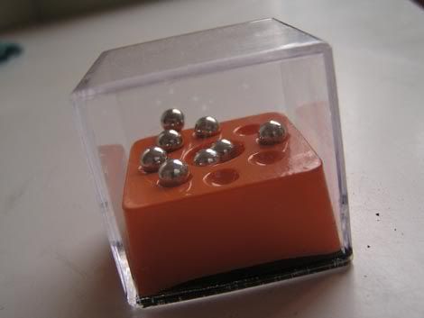
Most of us would probably have seen some of those little clear puzzle boxes in our lives. Housed within the little cube would invariably be a collection of little chrome spheres and an ‘environment’ for the spheres to move in.


Often, solution of the puzzle comes when the spheres are put into some specific locations in the environment. A typical puzzle might have a surface with dimples in it, and the spheres would have to be manoeuvred into the dimples.


The states (location) of each ball can be described using two orthogonal directions parallel to the main plane of the environment, and the height of the ball is the gravitational potential energy of the ball. As one can imagine, a ball’s gravitational potential energy is a function of the location of the ball, with the domain being the area bounded by the plastic box.


This particular problem requires that the balls be placed in the holes around the big hole. A brief inspection of the environment will show that the target holes are not as deep as the central trap, which implies that the global minima of the potential energy function lies within the central trap. Each of the target holes are a local minima, which means that a ball within the target is merely in a metastable state. Jerk it hard enough (give it enough activation energy) and it might roll out of the metastable state into the global minimum.


The difficulty is that there are many balls, and it is very possible that there will be one or two within the central trap at any one time. To relocate the balls away from the central trap, one would need to give it sufficient energy to jump out of the potential well. Unfortunately, this energy will also be supplied to the other balls, and they might jump out of their metastable target holes, and in turn drop into the central trap.

Control of the system is done by manipulating the box. There are 6 degrees of freedom in the control inputs: translation in 3 directions and rotation in 3 directions. However, the system itself has far more than 6 degrees of freedom (each ball can move independently of other balls), even if we neglect spin and potential energy of the balls. In short, it is impossible to deterministically control the system using the 6 control inputs- solution of the puzzle appears to be merely a probabilistic event.


Having noted a few characteristics (metastable state, global minima, activation energy, controllability) that contribute to the difficulty of these puzzles, we can go on to design harder and harder puzzles.

Of course we want the solution to be a metastable state. Once arrived at the solution, the balls should stay where they are unless jerked out of place. If the solution is in the global minima, the puzzle is almost trivial, which makes it less of a puzzle.

To make life difficult for the player, the global minima can be made to be very low compared to the metastable states. This would imply that sending a ball from the global minima to a metastable state requires a big bump, potentially disturbing other balls in the system.

Also, to make balls in the target metastable states easy to accidentally dislodge, the activation energy required to jump out of the metastable state can be made very small. This being the case, any small disturbance might easily remove the ball from its desired position.

Finally, use many balls to ensure that the 6 control inputs cannot fully account for all the balls’ behaviour.


If these concepts are taken too far, the puzzle will be impossible to solve in a reasonable time. Try shaking a room to try getting all 6 x 10^23 molecules of air to one corner of the room.


Labels: ,

Monday, October 17, 2005

Dramatic silence explained

Early this morning at about 3.30am, I had a supper of two slices of toast. Curious about the ambient temperature, I heaved open one of the windows for a whiff of outdoor nocturnal breeze.

As soon as the glass panes parted company, the silence from outside floored indoors like a surging wave of thick, transparent, lumpy, luminiferous porridge. Like pouring cheesecake mix into an intricately shaped mould, the curdled syrup of silence rapidly filled the large open spaces in my apartment before slowly seeping into the tapering nooks and narrow crannies. It was awe inspiring.

It was also shocking, to say the least. It would not be surprising if noise crept in from an open window, but to see the same effect with silence is an eye opener. After all, silence is just no-noise, not anti-noise or noise-inverse or negative-noise.


Here are some conjectures and fantasies designed to help explain the phenomenon of the surging syrup of silence.


Dramatic silence occurs when quiet noises can be heard. The situation does not need to be absolutely devoid of noise to qualify as dramatic silence. For example, late at night in Melbourne, the streets are devoid of traffic. Sometimes I can hear a motor vehicle, but it’s usually far away. Other times, rebellious birds make themselves known by chirping recklessly at 4am. It is these muted sounds that elevate silence to dramatic silence. In the afternoon, these sounds would certainly be drowned out by constant drone of traffic and aged trams rattling on their rails.

The phrase “so quiet you can hear a pin drop” is often used to describe silence. However, if a pin actually dropped and you do hear it go “plink”, the silence would be even more dramatic.

In a room, silence is usually exaggerated by a clock’s ticking, or another person’s breathing. If you were alone, and there was no clock, it would simply be a quiet but boring room.

Going back to the phenomenon of the surging syrup of silence, I can only conclude that the apartment was in a boring state of silence with only the annoying whine of computer fans as company. Opening the window let in the sounds of far away motor vehicles, highlighting that there were no other noises that usually masks these sounds.


Applications of the phenomenon of the surging syrup of silence

The most obvious manner to take advantage of dramatic silence is to manufacture dramatic silence. If you could make loud noises that sound like they are far away, or amplify sounds that are naturally soft, you can possibly make the area sound like it is quiet.

The simplest application of this manufactured silence is in the sale of enclosed spaces. If quiet is a good selling point (usually valid for luxury cars and residential property), then it might pay to install clocks with exceptionally loud ticking to trick the potential buyer. The salesperson could go something like, “Ooo…do you hear that? This car/place is so quiet you can actually hear the clock/my watch tick!”

And since clocks generally tick ahead with minimal noise, the unaware buyer might be in for a royal screw.


Labels:

Saturday, August 27, 2005

Daft engineer jokes

Slightly past midnight and I was feeling a little empty inside. I need food.

As I spread the peanut butter onto my freshly toasted bread, the thick paste began to melt, and slowly seeped into the pores of the bread’s surface.

Adrian saw me preparing to eat, and he decided to have a supper of toasted bread too.

We I talked rubbish for a while before he turned serious.

“Hey, ask you something…”
“Mmm?” My mouth was full of toast and melting peanut butter.
“I’m designing a tank farm [for my project]. Where do you think the control room should go? Should it be near the loading area, the pumps or the tanks themselves?”

We discussed the various possible locations before implicitly agreeing that it should be located away from the tanks, pumps and loading point.

“Yea, just locate the control room remotely. Like put it in Bangkok or something…”
“Or I could say that since it doesn’t matter, I’ll design the control room as a submersible and put it underwater, offshore.”

I then made a suggestion:

[The following has been adapted to fit a text format]

Since you do not want the control room to be near the tanks, pumps nor loading point, you should aim to put the control room at a location that as equally apart from each facility.

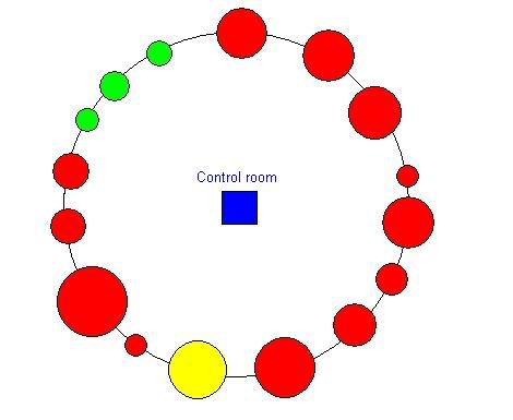
The most obvious way to do this would be to arrange the tanks, pumps and loading point in a circle, and put the control room in the middle. The illustration shows the control room as the square in the centre of a circle of facilities. Clearly, this is an impractical arrangement.


The other solution would be to place the control room infinitely far away. This way, the distance to each of the tanks, pumps and loading point would be the same.


Labels: ,