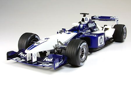
BMW Williams F1 team inspired template

Do the colours look familiar?
My brother modified his template recently, with a black/orange theme reminiscent of the eye catching but now defunct Orange Arrows F1 team.
Then Yvy mentioned that she would change her template earlier today. “How about this, you change scenery I change backdrop?” I asked her. She did change her template, so here I am.
[paragraph edited 6pm 18 Nov 05]
PS- the launch car looks impotent. They should have dailed in some (visible) negative camber into the front tyres to make it look more honest.
[edited 6pm 18 Nov 05]
PPS- This page was designed using Firefox. It looks a little retarded in IE. I don't care, "I'm going to snub IE."
Labels: blogging

<< Home